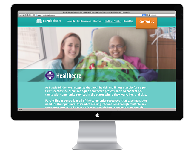


Approached by start-up tech company Purple Binder to complete a project that included branding strategy and website design. Partnering with a friend of mine from SCAD, Purple Binder came to us because they were gaining traffic with their product that, “connects people with resources that keep them healthy in their community,” and needed a makeover for their consumer-facing responsive website (as opposed to the product itself).
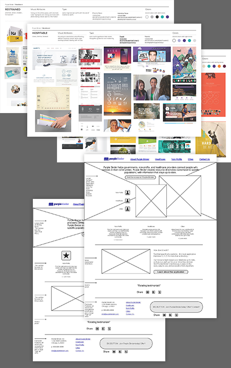
Since the project included branding consultation and guidance, we first started with presenting the client with moodboards to get a sense of which graphic styles, image treatments and typography they gravitated towards.

While the interface design became the final deliverable, more thinking tends to go into the structure and information architecture of the site. While the client was busy dissecting the moodboards, we got to work setting out a skeleton of the site, which would eventually be skinned with the UI design. After feedback and critique with the client, wireframes were solidified to be used in the final design.
In an effort to cater to messaging for all audiences, we segmented content into three major areas—Healthcare, City Governments and Non-profits—then concentrated on funneling those audiences to their respective pages. The result is an calculated information architecture that satisfies the needs of their audiences in an effort to drive sales and conversions.

A Gallery of Visual Communications by Gina Andracchio © 2014 | Hand-coded by Gina using a responsive design framework